FossAsia: Website Redesign
FossAsia: Website Redesign
About FOSSASIA:
FOSSASIA is an open-source community that develops software, organizes tech events, and promotes free software culture globally. Its website serves as the main hub for showcasing projects, events, community contributions, and resources.
Made By:
Ajay
Ajay
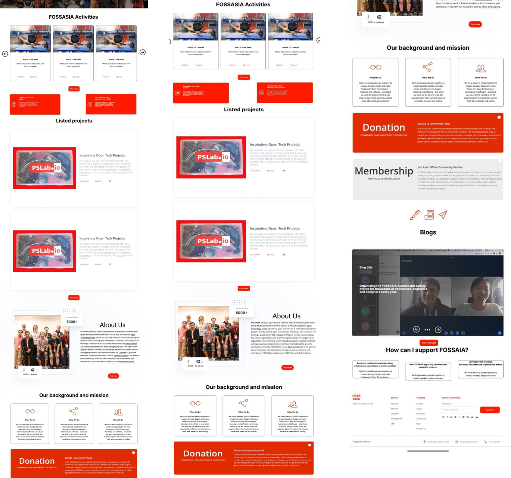
Problem Statement
The original FOSSASIA website suffered from:
Visual Inconsistency: Multiple styles, colors, and font sizes clashed, reducing brand identity.
Cluttered Layout: Overloaded homepage with scattered information and no clear hierarchy.
Poor Navigation: Complex menu structure making it difficult for users to find relevant information quickly.
Lack of Mobile Optimization: Pages were not fully responsive, leading to poor mobile experience.
Low Accessibility Compliance: Poor contrast and inconsistent typography affected readability.
Goals & Objectives
Create a clean, modern, and consistent visual design that reflects FOSSASIA’s tech-focused brand.
Simplify navigation and improve content structure for faster access to information.
Improve mobile responsiveness for a seamless multi-device experience.
Ensure accessibility compliance for all users.
Enhance user engagement through visual clarity and intuitive design.

Research Process
Methods:
Competitive analysis of tech and community-based websites.
Visual audit of existing FossAsia landing page.
Key Findings:
Inconsistent typography and spacing.
Poor alignment and lack of visual hierarchy.
Overloaded sections with no clear call-to-action.
Design Thinking Approach
Empathize: Understood user frustration with navigation and readability.
Define: Identified UI inconsistencies and unclear content flow as key issues.
Ideate: Sketched cleaner layouts with a clear structure.
Prototype: Designed high-fidelity mockups in Figma.
Test: Gathered peer feedback to refine typography and spacing.
User Persona
Name | Rohan Sharma |
|---|---|
Age | 25 |
Location | New Delhi, India |
Description | A tech-savvy student and open-source contributor who values quick access to resources and clean, organized content. |
User Goals | • Quickly find project information • Access community resources without confusion • Stay updated on events and news |
Frustrations | • Cluttered, inconsistent design • Hard-to-find navigation elements • Overwhelming unorganized content |
Event Frequency | Weekly visits to community pages |
Tech Comfort | High |
Device Usage | Laptop (70%) & Mobile (30%) |
User Journey Map
Stage 1 – Landing
Rohan opens the FossAsia homepage, excited to explore projects and events.
But within seconds, his enthusiasm fades — the page feels messy, with no clear starting point.
He hesitates, scanning the screen, wondering “Where do I even begin?”
Design Opportunity: Give Rohan a clear, welcoming hero section and consistent layout that guides him naturally.
Stage 2 – Navigation
He tries to find project information, moving his mouse to the navigation bar.
But the labels don’t match what he’s looking for, and the menu feels unstructured.
Frustration builds — “I can’t find anything quickly!”
Design Opportunity: Organize the menu with familiar labels and a logical structure so he can move confidently.
Stage 3 – Engagement
Rohan starts reading about events, but the walls of text overwhelm him.
Without headings or visual breaks, it’s hard to skim and pick out the most important points.
He’s tempted to just give up.
Design Opportunity: Use a clean hierarchy with clear headings, white space, and visuals that make scanning effortless.
Stage 4 – Action
Finally, he decides he might want to contribute or join an event — but the “How to Get Involved” section is hidden.
“Am I even in the right place?” he wonders.
Design Opportunity: Place bold, consistent calls-to-action where they’re easy to find and act on.
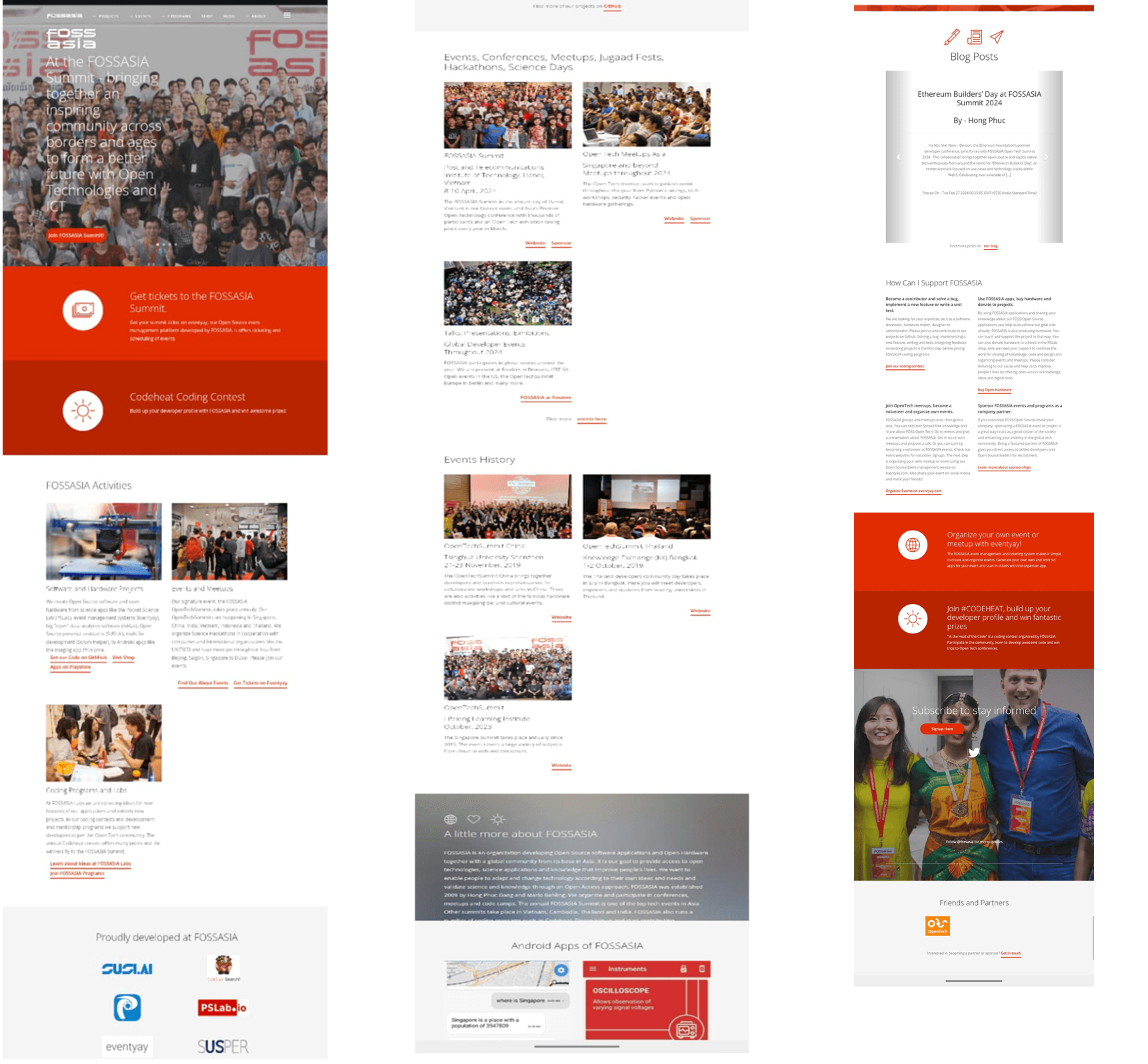
Final Design & Features
Consistent typography and button styles.
Clear CTAs and section separation.
Balanced use of white space for readability.
Outcomes & Impact
Improved clarity and usability of the landing page.
Stronger visual identity with consistent design elements.
More engaging first impression for visitors.
Conclusion
The FossAsia landing page redesign transformed a cluttered, inconsistent interface into a clean, user-friendly experience. By applying design consistency, improving navigation, and streamlining content, the project successfully enhanced both usability and visual appeal. This project reinforced the importance of structure, hierarchy, and simplicity in creating impactful first impressions.
Recent Designs

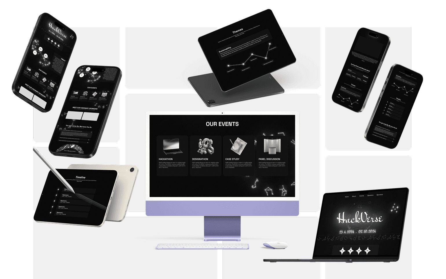

Recent Designs
Recent Designs
Let's Connect
Passionate about crafting user experiences.
Ready to join your team
Phone
+91 82876 93428
aajaykrbhandari@gmail.com
Let's Connect
Passionate about crafting user experiences.
Ready to join your team
Phone
+91 82876 93428
aajaykrbhandari@gmail.com
Let's Connect
Passionate about crafting user experiences.
Ready to join your team
Phone
+91 82876 93428
aajaykrbhandari@gmail.com
FossAsia: Website Redesign
FossAsia: Website Redesign
About FOSSASIA:
FOSSASIA is an open-source community that develops software, organizes tech events, and promotes free software culture globally. Its website serves as the main hub for showcasing projects, events, community contributions, and resources.
Made By:
Ajay
Ajay
Problem Statement
The original FOSSASIA website suffered from:
Visual Inconsistency: Multiple styles, colors, and font sizes clashed, reducing brand identity.
Cluttered Layout: Overloaded homepage with scattered information and no clear hierarchy.
Poor Navigation: Complex menu structure making it difficult for users to find relevant information quickly.
Lack of Mobile Optimization: Pages were not fully responsive, leading to poor mobile experience.
Low Accessibility Compliance: Poor contrast and inconsistent typography affected readability.
Goals & Objectives
Create a clean, modern, and consistent visual design that reflects FOSSASIA’s tech-focused brand.
Simplify navigation and improve content structure for faster access to information.
Improve mobile responsiveness for a seamless multi-device experience.
Ensure accessibility compliance for all users.
Enhance user engagement through visual clarity and intuitive design.
Research Process
Methods:
Competitive analysis of tech and community-based websites.
Visual audit of existing FossAsia landing page.
Key Findings:
Inconsistent typography and spacing.
Poor alignment and lack of visual hierarchy.
Overloaded sections with no clear call-to-action.
Design Thinking Approach
Empathize: Understood user frustration with navigation and readability.
Define: Identified UI inconsistencies and unclear content flow as key issues.
Ideate: Sketched cleaner layouts with a clear structure.
Prototype: Designed high-fidelity mockups in Figma.
Test: Gathered peer feedback to refine typography and spacing.
User Persona
Name | Rohan Sharma |
|---|---|
Age | 25 |
Location | New Delhi, India |
Description | A tech-savvy student and open-source contributor who values quick access to resources and clean, organized content. |
User Goals | • Quickly find project information • Access community resources without confusion • Stay updated on events and news |
Frustrations | • Cluttered, inconsistent design • Hard-to-find navigation elements • Overwhelming unorganized content |
Event Frequency | Weekly visits to community pages |
Tech Comfort | High |
Device Usage | Laptop (70%) & Mobile (30%) |
User Journey Map
Stage 1 – Landing
Rohan opens the FossAsia homepage, excited to explore projects and events.
But within seconds, his enthusiasm fades — the page feels messy, with no clear starting point.
He hesitates, scanning the screen, wondering “Where do I even begin?”
Design Opportunity: Give Rohan a clear, welcoming hero section and consistent layout that guides him naturally.
Stage 2 – Navigation
He tries to find project information, moving his mouse to the navigation bar.
But the labels don’t match what he’s looking for, and the menu feels unstructured.
Frustration builds — “I can’t find anything quickly!”
Design Opportunity: Organize the menu with familiar labels and a logical structure so he can move confidently.
Stage 3 – Engagement
Rohan starts reading about events, but the walls of text overwhelm him.
Without headings or visual breaks, it’s hard to skim and pick out the most important points.
He’s tempted to just give up.
Design Opportunity: Use a clean hierarchy with clear headings, white space, and visuals that make scanning effortless.
Stage 4 – Action
Finally, he decides he might want to contribute or join an event — but the “How to Get Involved” section is hidden.
“Am I even in the right place?” he wonders.
Design Opportunity: Place bold, consistent calls-to-action where they’re easy to find and act on.
Final Design & Features
Consistent typography and button styles.
Clear CTAs and section separation.
Balanced use of white space for readability.
Outcomes & Impact
Improved clarity and usability of the landing page.
Stronger visual identity with consistent design elements.
More engaging first impression for visitors.
Conclusion
The FossAsia landing page redesign transformed a cluttered, inconsistent interface into a clean, user-friendly experience. By applying design consistency, improving navigation, and streamlining content, the project successfully enhanced both usability and visual appeal. This project reinforced the importance of structure, hierarchy, and simplicity in creating impactful first impressions.
Recent Designs
Recent Designs
Recent Designs
Let's Connect
Passionate about crafting user experiences.
Ready to join your team
Phone
+91 82876 93428
aajaykrbhandari@gmail.com
Let's Connect
Passionate about crafting user experiences.
Ready to join your team
Phone
+91 82876 93428
aajaykrbhandari@gmail.com
Let's Connect
Passionate about crafting user experiences.
Ready to join your team
Phone
+91 82876 93428
aajaykrbhandari@gmail.com